Double Page Spread
Double Page Research
Mary Berry’s Country House Secrets
Here is a two page spread from the Radio Times talking about 'Mary Berry’s Country House Secrets' I have annotated this page . I am going to take away the Large style title and the pull quotes. I think that pull quotes are very useful for the audience as the inform the readers of the interviewees opinions.
Here is a two page spread from the Radio Times talking about 'Mary Berry’s Country House Secrets' I have annotated this page . I am going to take away the Large style title and the pull quotes. I think that pull quotes are very useful for the audience as the inform the readers of the interviewees opinions.

Elizabeth and Phillip: Love and Duty
This two page spread really well presents what the documentary is about through how it is presented, rather that just through titles and images it has carefully been designed in a way that is reminiscent of old family artifacts and the smaller images are displayed like genuine film photographs laid out on a table. The two page spread is in a Radio Times magazine which I think is the correct place for such a documentary as it will be more targeted to wards the older population because of its subject. I will take away ideas from how this has been presented but will make it appropriate and relevant, so for my gig documentary I will look maybe into a styling of treasured set lists and merch items rather than old letters, with vintage gig photos rather then old film photographs.
This two page spread really well presents what the documentary is about through how it is presented, rather that just through titles and images it has carefully been designed in a way that is reminiscent of old family artifacts and the smaller images are displayed like genuine film photographs laid out on a table. The two page spread is in a Radio Times magazine which I think is the correct place for such a documentary as it will be more targeted to wards the older population because of its subject. I will take away ideas from how this has been presented but will make it appropriate and relevant, so for my gig documentary I will look maybe into a styling of treasured set lists and merch items rather than old letters, with vintage gig photos rather then old film photographs.

Naples 44'
This two page spread is about Naples 44' a history documentary talking about the war in Naples which is so surprising to people of today because Naples is such a popular holiday destination. The two page spread differs from the first one I have analysed as the photograph is the background as well as the key image. This means that the audience gets a bit more overwhelmed by the photograph, I think it is more suitable for a modern documentary than something about past and historical events. However it does work for this documentary because the photograph features a large amount of empty blue sky. The use of smaller additional photographs in the style of film photographs relates well to the documentaries topic.
This two page spread is about Naples 44' a history documentary talking about the war in Naples which is so surprising to people of today because Naples is such a popular holiday destination. The two page spread differs from the first one I have analysed as the photograph is the background as well as the key image. This means that the audience gets a bit more overwhelmed by the photograph, I think it is more suitable for a modern documentary than something about past and historical events. However it does work for this documentary because the photograph features a large amount of empty blue sky. The use of smaller additional photographs in the style of film photographs relates well to the documentaries topic.

Local and Live
This two page spread is about 'Local and Live' a small local music festival set in Tunbridge Wells. The double page spread talks about the last ten years at the festival through an interview format, the article of the double page spread is the interview asking a question and the interviewee giving large in depth answers, all the answer were written in full. I think this is a very effective way of presenting an interview rather then a few small quotes the whole interview is included, it allows the audience to gain much more knowledge and further insight. Because the double page spread is from a smaller local magazine rather then a national listings magazine it features small adverts on most pages this is something I will not be replicating in any of my double page spreads.
This two page spread is about 'Local and Live' a small local music festival set in Tunbridge Wells. The double page spread talks about the last ten years at the festival through an interview format, the article of the double page spread is the interview asking a question and the interviewee giving large in depth answers, all the answer were written in full. I think this is a very effective way of presenting an interview rather then a few small quotes the whole interview is included, it allows the audience to gain much more knowledge and further insight. Because the double page spread is from a smaller local magazine rather then a national listings magazine it features small adverts on most pages this is something I will not be replicating in any of my double page spreads.

Experimentation
Primary Images


Key Image For Double Page Spread
The photographs below I have taken and are all possibilities to be the key image for my ancillary task Double Page Spread.

|
This photograph here also of the Colston Hall, features a person passing in front of the building in a blur I think this would be a really good photograph as it is of the biggest music venue in Bristol. It is distinctively Bristol, being named after an important figure in Bristol history, it holds connotations of iconography.
The photograph is quite a dark photograph and I took it on an overcast gloomy day, if I were to use this photograph for the double page spread I would need to increase the brightness and contrast to make a more exciting and engaging colored photograph. |

This photograph is of the Canteen where the majority of my footage was taken, including the interviews and location shots, it is a community hub with a live music venue on the ground floor. The hub is a center for arts in Bristol a real grassroots venue allowing a variety of musician and artists to exhibit their art on a daily basis. I took this photograph on a significantly lighter day than I took the photograph of the Colston Hall, the weather was clear and allowed me to take a much more positive photograph with bright blue skies. If I were to use this photograph I would increase the contrast to make the colours pop more.
|

Above is a photograph of the Thekla a very popular gig venue infamous around the country for being on a boat. I have taken the photograph from an angle that makes it seem important and powerful it, this creates a great image to highlight the importance of the venue that holds a big part in the topic of my documentary. The photograph is light and well balanced with a strong composition. If I were to use the photograph I would not edit it much.
|
Experimentation with Fonts

Here is have put the First part of the title in retro font reminiscent of the 70's disco and a record label from that time. The Bristol part I have put in a bold title that looks like the Hollywood sign but more edgy and graffiti stencil like.
|

Here I have placed the first part at an angle to accentuate the retro styling of the font. It leans perfectly on the roof of the Colston Hall, and leads off into the air.
|

Here I have experimented in changing the name to "a music scene" trying it in a simple font (Bookman Old Style) I think this font holds simple connotations that cause the name to be looked over causing one to focus more on the Bristol element which I have presented in a bold, traditional font that I feel really screams Bristol, Decorated035 BT.
|
First Draft

|
To the left if my first draft and styling of a double page spread, I have used pull quotes, a key image as well as further images, and a more traditional layout, wit white pages and small images among text. There are many different fonts on this First Draft; 'Myriad pro' for the shows name, show time and date. This is also the font used for the main body of text creating a continuity between the publication, just like if it were to be in a listings magazine. I think that is the main strength of this first draft, it looks real it passes all the tests to be a Double Page spread in a Radio Times style publication. But I don't think it is in the style that I want to represent my documentary as it is very simple, and clean. Which are not negatives but don't quite embody the documentary.
|
Second Draft

|
On my second draft I attempted to create a double page spread that was like a a person had laid there Polaroids and film photographs down on a surface, with four different images along the side in a relaxed manor. The title of the two page spread is quote from one of the interviewees it works successfully and gives insight into the topic of the documentary, I have also included the actual titles from the documentary on the key image to create continuity between ancillary task and the documentary. But also to provide the audience with information, if it was real people may recognize this from trailers they had seen online or posters they had seen around, causing them to stop and read the article, if they were interested. What I prefer in this double page spread from my previous one is that the text is in one large body rather than be divided on different sides of the page. This makes it much easier reading for the reader.
|
Third Draft

|
Here on my third double page spread used a full image style like on the 'Naples 44' double page spread I researched, at first I didn't think it would work that well for a double page spread but I really like it with this photograph, it accentuates the large, loud, intimidating qualities of the building, which I think represents the large, unapologetic loud nature of the Bristol music scene. Also the vibrant colors of the photographs I have featured also hold connotations of the vibrancy of Bristol and Bristol music scene. Like my second double page spread I really like that the body of text is all together making reading easier. Here Like my previous drafts I used a white background but think it is not quite right for the double page spread, as this is my favorite so far I think I will use the layout and photographs for my final Double page spread but recolor the background to go with the key image more naturally. My favorite element of this one is how I have placed the page number with extra information discretely on the edge of the page, it looks smart and professional and the use of the font 'Caslon Bd BT' is highly stylistic of a music magazine which suits my documentary but also keeps in fitting with the brief.
|
Final Double Page Spread

Here I have chosen to use a Black background rather than a white background. I have done this because I think that the Black looks more professional and effective as it fades to black from the dark edges of the photograph. Before with my 3rd draft I considered using white rather than black but I don't think it really works with the photograph. On the bottom of the page I have presented fourth further additional photographs almost in the style of a film reel, or location shots. I think this in keeping with the documentary, but also gives great insight and more information of the style of the documentary. Next to these five photographs are two Polaroid styles photographs from gigs to show the reader that the documentary is about the gig scene in Bristol, you can clearly its is rock indies music from the contents of the photographs, this means that audiences will not be confused in thinking it is about drum n bass another huge music scene in Bristol. I really like my use of a pull quote in the middle of the body of text. It draws ones eyes into the article and causes you to be interested in reading it. I have also placed a black line done the middle to show where the seem of the listings magazine would be.
Why I made my final decisions...
I choose this photograph over others as I think it is really captivating, with bold colours and shapes. But also holds great positive connotations of Bristol and the music on offer. I choose to have a black background over a white like traditional as it suits the photograph more with the dark edges of the photograph, and the dark figure that is obscured by the text. I choose to have a range of photographs along the bottom of the page to display different locations and buildings in the documentary, that hold various different connotations.
I choose this photograph over others as I think it is really captivating, with bold colours and shapes. But also holds great positive connotations of Bristol and the music on offer. I choose to have a black background over a white like traditional as it suits the photograph more with the dark edges of the photograph, and the dark figure that is obscured by the text. I choose to have a range of photographs along the bottom of the page to display different locations and buildings in the documentary, that hold various different connotations.
Newspaper Advertisement
Newspaper Advertisement Research
|
Citizenfour
A biographical historical documentary about Edward Snowdon |
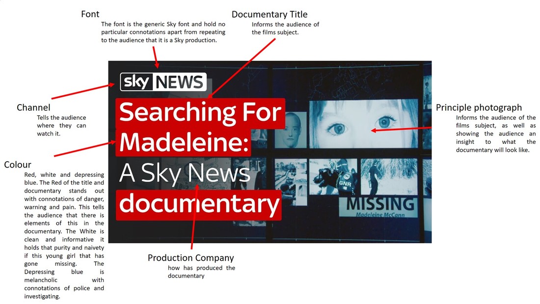
Searching For Madeleine: A Sky News documentary
Here is a poster promoting the documentary made by Sky News |

|
|
Music Documentary Posters
|
Below is the poster for the documentary about Glastonbury Festival called "Glastonbury the Movie". The poster features a man that has fallen over drunk at the festival on a muddy day, wearing wellies, he is holding up his hands making two 'V signs'. The fact that the man is on the floor shows both exhaustion, possible intoxication from drugs or drinks, and that the man has struggled in the mud. The wellies covered in mud, mud that holds distinct connotations of British music festivals and Glastonbury in particular, straight way inform the audience even before they have read the title the poster is advertising something to do with British music festivals. Underneath this mans legs is a photograph of the festivals audience, hands and arms frown in the sky, there is a performer starting to crown surf. This image holds strong connotations of a crazy wild music festival with people that have lost all inhibitions and let loose.
From this poster I will take away displaying an authentic representation of gig culture as I feel this poster has really well displayed what Glastonbury is actually about. Elements of this poster that i think do this are shoots from the festival with authenticity and candidness like the photograph of the man lying on the ground. For my poster I will create drafts that feature similar images of the audiences and people that attend gigs in Bristol. 
|
Below here is the poster for a very similar documentary to "Glastonbury the Movie" it is advertising the film "Woodstock the Movie" . The documentary is about the festival that took place in 1969 called 'Woodstock' the festival only ran for a year and is infamous around the world for being a crazy drug filled music festival with once in a lifetime performance from artists like Jimi Hendrix. The poster features 6 key images with the festivals logo and name underneath them. Each image has a caption: peace, people, love, grass, music, America. Each of the photographs are from the festival, the peace photograph is of an idyllic part of the farm with the sun rising over the barn and trees in the background, the people photograph is of a huge crowd. The love photograph is of a naked couple climbing in to a river, the grass photograph is of a perfect grassy field with a couple lying in the left side of the photograph. The music photograph is of an artist in a flared outfit throwing his arms in the sky with a stage light in the background and the last one; america is of a girl that has passed out in front of an america flag. I really like how the poster has picked out 6 key aspects of the festival and displayed them individually rather then just have a simple photograph of the festival. For one of my drafts I will create a poster with different elements of gig culture and Bristol highlighted in a similar way.

|
Channel Specific
I have carried out some research of VICELAND the channel I plan to release my documentary through, VICELAND is a subsidiary of Vice Media, commissioning, producing documentaries about subjects that are foreign to most of the population with a focus on a younger audience and a raw, abrupt technique to to highlighting social issues. Below I have analysed some of the posters for their channel which is available on Sky and Now TV to highly popular TV providers.

Above and to the left is a range of different VICELAND Posters, featuring full images and raw subjects.

|

Below is many different forms, sizes, styles and spacing of the font 'Helvetica' it is an Apple font that is used by many edgy, indie media companies. It is the main font used by Vice and VICELAND. In the photograph you can see a picture of Drakes No.1 Single Hotline Bling whose cover is '1-800-HOTLINEBLING' in Helvetica repeated across the page, this shows how popular the font is and used on such a variation of products. Another photograph on the wall is a TOM FORD poster, this shows how it is used by fashion designers, artists, rappers and filmmakers.

Above is a 'noisey' poster for their launch party, it features their logo which dominates all the other typography on the poster. At the bottom of the page you can see the information and links that advertise the poster even thought there is a full image and it has been typed in a tine size. It is so clear as the photographer has faded the image to black on the bottom left parts of the poster. This means that the key subject of the photograph is not ruined by text and the text is focused and clear.
|
Experimentation's
Primary photographs


Secondary Photographs - used for experimentation


VICELAND Style
VICELAND style posters would be if I were to produce the documentaries for the VICELAND TV channel and using traditional methods to broadcast the documentary. In contrast VICELAND's advertisement techniques are greatly different to most modern forms of posters and newspaper advertisements. SEE Channel Specific Newspaper Advertisements Research for examples. VICELAND tend to have their posters with white backgrounds and lots of open space with no function in their posters, they also really like repeating fonts across the pages. I big common denominator in all their posters is the use of 'Helvetica' font that creates continuity and a simple effective look.

1st Practice Draft
To the left is my first practice draft, I have used photographs from other photographers so I can experiment with different styles and layouts before taking my photographs. The photograph that I have included is of an artist singing energetically with his arm flung towards the crowd. I have placed the VICELAND logo at the top of the poster centrally in the style of a VICELAND poster, this shows that I have researched VICELAND posters kept continuity just as if I were actually commissioned to make a newspaper advertisement for a VICELAND documentary. 
|

2nd Practice Draft
Here I have experimented with different styles of VICELAND posters this one is much more edgy with the use of the font 'Helvetica', this tells the audience that it is made for a very youth, middle class audience, which I think limits my audience. However I think it is very aesthetically pleasing and displays the documentary well. If the central photograph was from my documentary. I have edited the photograph and recolored slightly making a very cool photograph in a film style that also slightly limits the target audience but also could be perceived as reminiscent of the days without smartphones and digital cameras. 3rd Practice Draft
Here I really like how I have repeated 'a music scene' in the 'Helvetica' font it creates a really cool look to the photograph and highlights the name of the series. This style using a white background, does mean the information is really easy to read and hard to ignore. My 3rd Practice draft I really like and the use of my photographs makes it more relevant and fitting. However as I have talked about with my others the style is targeted at a certain audience and after considering how this would greatly restrict my audience I will not have this style as my final. |
Full image Style
The full image style newspaper advertisement would be for if I were to release the documentary onto YouTube via VICEs music related subjects focused channel noisey

1st Practice Draft
With this newspaper advertisement I have opened a generic 'gig photograph' in Photoshop, I have then painted on a black vignette with the paint tool, this creates a vintage style photograph. In addition it allows me to put the black VICE logo and links from another 'noisey' poster, in a professional looking way. I have overlaid my original title using the text tool, however this advertisement is different to the one on the left, as here I have used 'bookman old style' rather than 'Helvetica'. Which I think creates a better title as it is smoother and more natural. |

2nd Practice Draft
Here with this Newspaper advertisement I have kept everything the same but the font of 'a music scene', on this advertisement I have typed the series title, and production in 'helvetica' I have done this to experiment with the font most popularly used by VICE and Noisey, I have done this to see what affect it has on my poster, I think it is very imposing and overpowering to the 'BRISTOL' section of the title which is bad as the main focus and difference of this documentary, to others in the series, is that it is investigating a music scene in Bristol. I also think the font looks awkward and out of place on the advertisement, it does not advertise the documentary but encourage you to turn the page. |

3rd Practice Draft
For this style of Newspaper advertisement I think that the use of 'Bookman Old Style' is much more effective than 'Helvetica', however because the photograph landscape and the building really suits landscape I don't think it is quite right for the poster. I will take some more photographs of different venues that are featured in my documentary. |
4th Practice Draft
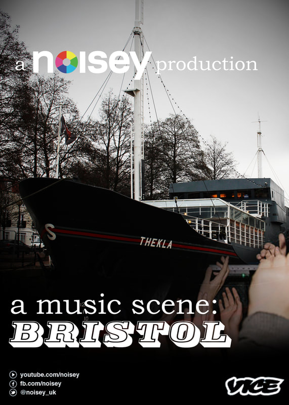
Here is the exact same newspaper advertisement as practice draft 1 but uses my original photograph, I think the photograph I have taken of the Thekla works really well with the coloring, style and fonts of this advertisement. |
Full image and Viceland Fusion Newspaper Advertisements

1st Practice Draft
This newspaper advertisement features the same photographs, title and coloring as the newspaper advertisement diagonally above. However I have changed the layout and style of the titles and branding. For this advertisement I have centered the title and the different branding. I have used the 'VICELAND' logo to create a mixture of the 'VICELAND' style and the full image newspaper advertisement style. I think the poster is very modern, exciting and appropriate for the chosen channel. |

2nd Practice Draft
Here this photograph has changed and really creates a completely different poster, the colors are considerably different carrying connotations of vibrant, exciting music scenes. The shutter speed of the photograph also creates a connotation of fast pace and generates a feeling of inter city , and bustling city life. |

|
Final Newspaper AdvertisementHere I have used a different photograph again, I have added in addition all primary photography which I took at Gigs to highlight the music element of the documentary. I really enjoy the vibrancy of the photograph and the bright colours, I think they will draw readers gaze into the advertisement.
I think that the full image style Newspaper Advertisement is much more effective at engaging the audience, the full image draws the readers eye into the poster. The large format of photograph also means the audience is informed of the documentaries topic, it allows one to understand what the documentary is about, and to see what style and look the documentary is shot in. |
Photo from iheartgigsID
